Every year, thousands of new businesses launch, and each one needs a logo. With so many designs flooding the market, it’s easy to fall into the trap of cliché. The lightbulb for “ideas,” the globe for “international,” the generic handshake for “trust” — we’ve all seen them. While familiar symbols are safe, they rarely stand out.
Creating a logo that avoids clichés is essential if you want your brand to be memorable, meaningful, and truly unique. In this article, we’ll explore why clichés happen, how to identify them, and — most importantly — how to design beyond them.
Let’s break free from the obvious and get creative.
What Are Logo Clichés, and Why Do They Happen?
Clichés are overused visual tropes — symbols or styles that have become so common they’ve lost impact. In logo design, they emerge when designers default to familiar metaphors without digging into the brand’s unique story.
Common Logo Clichés
- Lightbulbs to represent creativity or ideas
- Globes to suggest worldwide reach
- Abstract people in a circle to imply a community
- Shields for security companies
- Mountains for “strength” or “adventure”
- Arrows in tech logos to suggest speed or direction
These aren’t bad symbols — they’re just lazy when used without context or originality.
Why Do Designers Use Them?
- They feel safe. Familiarity feels reliable.
- Time constraints. Under tight deadlines, shortcuts are tempting.
- Trend-following. Designers emulate what’s popular, often subconsciously.
- Lack of research. Without a deep brand understanding, default symbols fill the gap.
A cliché logo may look clean and professional, but it won’t make your brand stand out.
The Risk of Using Clichéd Logos

Using a cliché undermines your brand identity. At best, it makes you forgettable. At worst, it makes you blend in with competitors or look generic.
Real-world example:
Consider how many consulting firms use a minimalist lettermark inside a blue circle. It’s functional, but try remembering one specific example — hard, right? That’s the issue. With a logo creator, you can craft something more recognizable and distinctive — not just “clean.”
How to Spot and Avoid Logo Clichés
Step 1: Research Your Industry — Then Go Deeper
Start by reviewing logos in your sector. What do they have in common? Identify the recurring elements — then consciously avoid them unless you can twist the idea in a fresh way.
Step 2: Ask the Right Questions
- What makes our brand different?
- What values do we really stand for?
- What emotion do we want to trigger?
Let your brand’s personality guide the visuals, not trends.
Step 3: Look Outside Your Industry
Some of the most iconic logos borrow from unexpected places. Draw inspiration from architecture, nature, history, or your company’s origin story. A unique metaphor or cultural reference can make your logo resonate on a deeper level.
Design Strategies to Replace Clichés
1. Focus on Typography
Custom lettering or a thoughtfully chosen font can carry personality without the need for a symbol. Think of Coca-Cola or Google — both logos rely heavily on type for identity.
2. Use Negative Space Creatively
Instead of relying on overused icons, integrate meaning through smart use of space. The FedEx logo, with its hidden arrow, is a classic example.
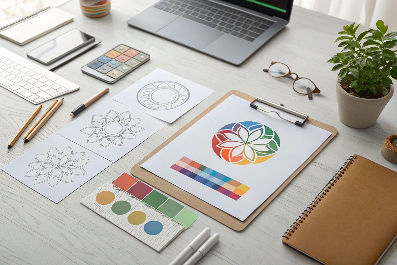
3. Build a Story-Based Icon
Instead of generic metaphors, use your company’s story. If your business started in a garage, use that shape or symbol. If your product solves a niche problem, reflect it subtly in the design.
Mikhail Khomutetsky, branding strategist:
“A powerful logo doesn’t shout a message with obvious symbols — it whispers it through originality. The best designs speak volumes with a single, well-crafted detail.”
Tools and Exercises to Break Free From Cliché
Visual Brainstorming Grid
| What You Want to Say | Obvious Symbol | Fresh Metaphor Ideas |
| Innovation | Lightbulb | Seedling, orbit, glitch effect |
| Global Reach | Globe | Compass, thread, migratory bird |
| Growth | Arrow | Rings of a tree, staircase, unfolding paper |
Use a table like this to push beyond the default imagery and find more personal, creative symbols.
Comparison: Cliché vs. Conceptual Logos
| Aspect | Cliché Logo | Thoughtful Logo |
| Message | Generic and broad | Specific to the brand story |
| Recognition | Easily forgotten | Memorable and unique |
| Originality | Copies common industry templates | Uses custom elements or fresh metaphors |
| Brand fit | Feels impersonal | Feels authentic and intentional |
Tips to Keep Your Logo Fresh
- Avoid design templates that push standard icons.
- Limit references to industry tropes during brainstorming.
- Ask: “Could any brand use this logo?” If yes, it’s probably too generic.
- Use moodboards with varied sources: photography, art, culture.
- Test on outsiders. If it feels familiar to everyone, dig deeper.
FAQ
Should I completely avoid industry symbols?
Not necessarily. You can use them — but reinterpret them. The key is to avoid obvious or literal execution.
Can simplicity still be original?
Absolutely. Originality doesn’t require complexity. A simple, unexpected twist makes a minimal logo memorable.
How can I check if my logo is cliché?
Google similar companies and compare. If your logo feels interchangeable with many others, it’s time to revisit the concept.
Conclusion
A logo is more than a label — it’s the visual handshake of your brand. Falling into cliché may seem harmless, but it prevents real differentiation. Instead of echoing what’s already out there, take time to understand your brand, explore unexpected directions, and craft a logo that speaks uniquely for you.
Clichés fade. Originality lasts.